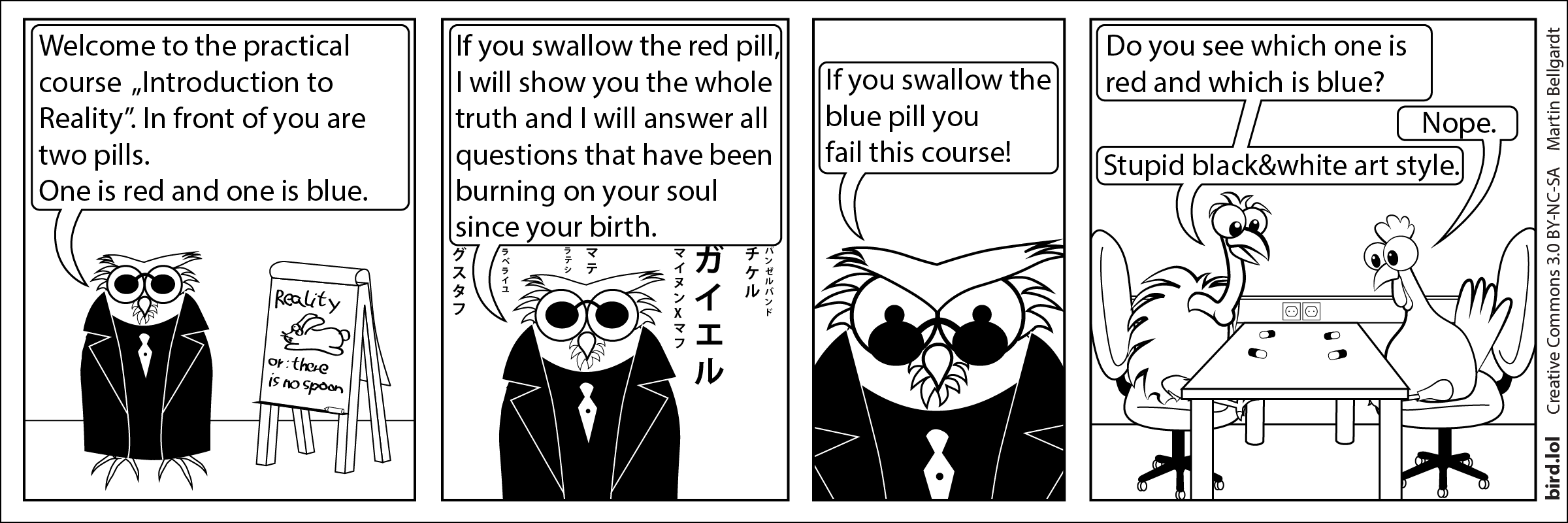
Yes, the art style of these comics was originally caused by the fact that the "Geier", i.e. the newspaper this comic was published in. Since it would have been too expensive to print in color, I made all the comics black and white. I could have used grayscale, but I like this fully black and white style a lot better. That's why I stuck with it, even or the web version. I also think this makes the comic quite unique, in a world where everything has to be eye catching, flashing, shining and blinking.
Comic transcript
Panel 1:
O is dressed up with sunglasses and a black trench coat. Behind them is a flip chart that reads: "Reality - or: there is no spoon"
O: Welcome to the practical course „Introduction to Reality”. In front of you are two pills. One is red and one is blue.
Panel 2:
Japanese letters start to trickle down to make the Matrix reference even more obvious
O: If you swallow the red pill, I will show you the whole truth and I will answer all questions that have been burning on your soul since your birth.
Panel 3:
O: If you swallow the blue pill you fail this course!
Panel 4:
G and H are sitting on a table. There are two pills in front of each of them. They are indistinguishable, since they are drawn in black and white.
G: Do you see which one is red and which is blue?
H: Nope.
G: Stupid black&white art style.